Minder Dashboard
Collaborators:
Payam Barnaghi, Chair in Machine Intelligence Applied to Medicine
Severin Skillman, Software developer
Magda Kolanko, Clinical Research Fellow
Matthew Harrison, Designer
and the Minder Monitoring Team
What was the need?
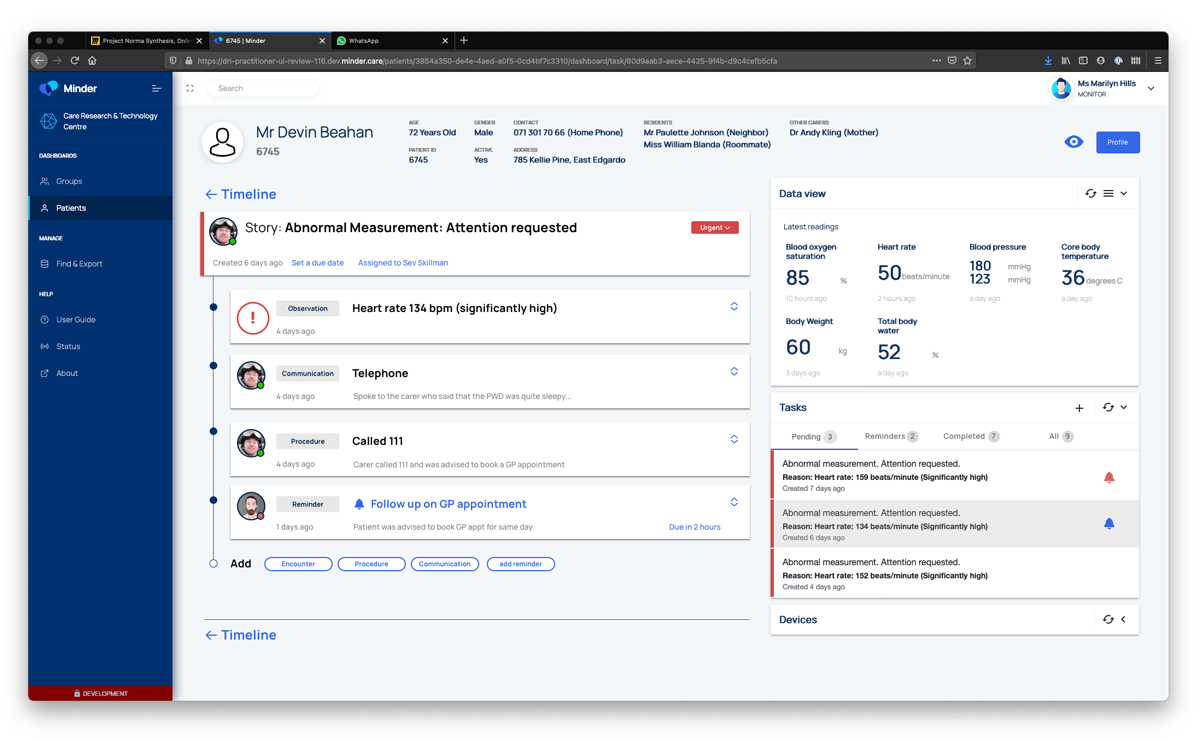
Central to the Minder system is a small monitoring team that responds to data coming from the participants’ homes, which acts as the primary point of contact for participants. The team may respond to data that indicates that the participants may be unwell, for example a high temperature reading. Missing data could indicate that the participant is unwell, or that a device is not working, and so is also a cause for communication with the participants.
These ‘alerts’, and interactions are managed via a digital dashboard that provides the monitoring team with the information they need to ensure the smooth running of the research, to identify and respond to health concerns, and input observational data gathered via conversation with participants.
The centre initially used a system inherited from a previous study, but there was a need to create a new system purpose made for Minder, which could incorporate all that had been learned with the previous system, and could be intentionally designed to be scalable and interoperable.
Project stage
What were the aims and objectives of the project?
The aims of the Minder platform are to enable the monitoring team to manage as productively as possible, the cohort of participants and the devices in their homes, facilitating interactions that are desirable to both researchers and participants alike. The dashboard needed to be able to represent data to the clinical oversight group when specific cases require clinical review, and enable researchers to curate and export data sets for analysis.
The successful design of the Minder dashboard is instrumental in making sure that researchers get the high quality data they require from the participant’s homes, whilst ensuring that the participants have a positive experience being part of the study.
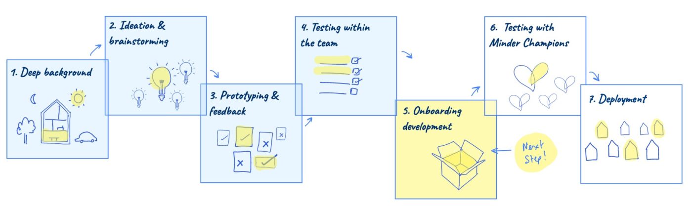
How was the project approached?
This project was structured as an ongoing collaboration between the computational team and the design team, with regular input from study participants, clinicians, the monitoring team and researchers across the centre. We took an agile approach responding to the evolving needs as the platform was developed. The designer also attended weekly clinical operations and clinical review meetings to understand the nature and breadth of issues that the dashboard needed to address.
What role did Patient and Public Involvement and Engagement (PPIE) play in this project?
The primary users of the Minder dashboard are the monitoring team, researchers and clinicians who need access to the data from the participant’s homes. However research participants are very important secondary stakeholders within this system, as the experience they receive as part of the study is directly influenced by the effectiveness of the dashboard. For this reason we spent a lot of time talking to participants in the study about their experience with the previous system and how they felt about the support and interactions they received from the research team. Insights from participants about how they would like to engage with the research team informed many aspects of the dashboard design, alongside the needs of the researchers and clinicians.
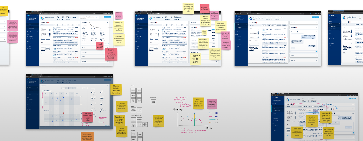
For this project the user interface was co-designed alongside members of the monitoring team, and the clinicians and researchers who would use it. With the whole team working remotely through the COVID pandemic, we set up twice weekly online co-design sessions with a designer, software developer, clinician and monitoring team member to work through all aspects of the dashboard as it was developed. We use online whiteboards (Miro) to iterate designs together and create reference materials for the developer.
What were the key insights to emerge?
- User research with participants in the study demonstrated there are broadly two types of participants. There are some who particularly value a regular phone-call from the monitoring team, a familiar voice who they could get to know and trust. Participants who were glad someone was keeping an eye on them, and valued the personal connection. The second type, more likely to be working during the day, or not be live-in carers, told us that the level of interaction increased the burden of participation in the study. Therefore, The Minder dashboard needed to do two things; ensure that unnecessary contact was minimised, and help the monitoring team get to know the participants. Designing for this outcome resulted in features including ‘preferred names’ and photographs/avatars in the dashboard to help users recognise participants and relate to them in terms preferred by the participants. We also created features to record more information about the support network, daily routine and home environment so that the monitoring team could relate to the individuals better.
- As a system that is designed to scale, we put a lot of thought into how the monitoring team collaborates to share or divide tasks across the cohorts. There is flexibility for team members to ‘own’ tasks relating to participants they know well, while also having a transparency that allows them to work effectively together, especially in the case of staff absence or handover.
- The challenge of minimising unnecessary calls is addressed through a concept of ‘issues’ within the dashboard. This is a feature that allows the monitoring team to define and group events (e.g. high temperatures, observations etc) into evolving issues, that can be watched and responded to appropriately. For example, an ‘issue’ may start as a high temperature, but could evolve into a diagnosed infection, and then a hospitalisation for treatment. Allowing these ‘events’ to be grouped and monitored as a ‘narrative of interest’ creates more timely and meaningful contact between the monitoring team and participants. ‘Issues’ also provides more context for clinical reviews, and allows researchers to measure how effectively the system is able to monitor and resolve healthcare and technical concerns. Another example might be persistently high blood pressure readings; treating these as an ‘issue’ allows the high readings that trigger ‘alerts’ to be treated as one thing to be addressed rather than a series of discrete events, each with a separate follow up action.
- From working with all stakeholders, we are able to build features in the dashboard that allow effective escalation of concerns about participants to the clinical teams for review. We worked hard on finding effective ways to compare charts of data within the dashboards that could assist with diagnosis, and create lists of participants’ ‘issues’ that could be presented in multi-disciplinary meetings.
- Finally, the researchers are usually after background information to contextualise the data emerging from the homes. This is especially relevant in trying to understand episodes of agitation or aggression, or sleep disturbances picked up on sensors. We found that the monitoring team often were getting the background information in phone conversations, but were not able to effectively input and label the data into the system. We therefore developed a notion of a timeline (inspired by facebook and others), and an input interface with a variety of structured forms to enable fast, labelled data to be documented while on the phone with participants. Observational data from behaviours, to appointments, carer-well being, to injury and mood, as well as technical device issues can all be quickly, and securely gathered.
Next steps
As of March 2021, the Minder Dashboard is in the final stages before an alpha release. It is currently being tested with simulated data, and going through detailed user interface review with the monitoring team. We will continue an iterative approach to developing the Midner dashboard for the coming years.