
The Minder brand
Collaborators:
Sarah Daniels, Health and Social Care Lead
Pip Batey, Designer
Matthew Harrison, Designer
Lenny Naar, Designer
and Minder Champions / research participants.
Minder brand resources
Minder Brand guidelines (PDF)
Minder language and terminology guide (PDF)
Positive Language – an Alzheimer’s Society guide to talking about dementia (PDF)
What is the need?
We believe that a strong brand can transform engagement in our trial, leading to better outcomes. Why so?
Firstly, what is a brand?
“A brand is a gut feeling someone has about an organisation. It’s a gut feeling because we’re all emotional, intuitive beings, despite our best efforts to be rational. It’s a person’s gut feeling because in the end, the brand is defined by individuals, not by organisations. Each person creates her own version of a brand in her mind. While organisations can’t control this process, they can influence it by communicating the qualities that make an organisation different from others. In other words, a brand is not what you say it is, it’s what they say it is.” –
Marty Neumeier, The Brand Gap (2003).
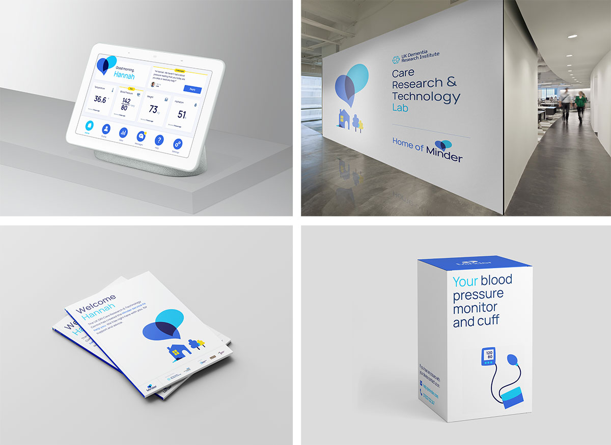
In a more tangible sense, a brand is a distinct visual language and tone of voice with a clear point of view that is used in a consistent way across multiple products and services. It is made up of an identifying logo, name, colours, fonts, images, illustrations, values and principles.
The UK DRI Care Research & Technology Centre at Imperial College London and the University of Surrey, is supported by Surrey and Borders NHS Foundation Trust, and suppliers such as Howz. The centre is funded by Alzheimer’s Society, Alzheimer’s Research and the Medical Research Council. The Centre is partnering with Hamersmith and Fulham council and Imperial College Healthcare NHS Trust. Furthermore some participants will be familiar with a previous study from University of Surrey called Technology Integrated Healthcare Management (or TIHM as it became known). If ever there was a need to simplify this from the perspective of the research participant and provide a recognisable common brand language, this is it!
Due to the different research streams, products and services designed for people with dementia within the UK DRI Care Research & Technology centre, we saw a key opportunity and need to shield potential and current participants from the organisational complexity of the centre to prevent them from feeling overwhelmed. Offerings designed by various internal groups infrequently consider the end-to-end experience. For the people at home, the experience should feel consistent and seamless – from the recruitment letter they receive in the post to the different technologies that are placed within the home. This streamlined approach not only ensures all outputs are considered from an accessibility point of view, but also builds trust in the service and therefore should result in a higher engagement level – eg. improving communication, inputting data, feeling like they are a part of something bigger.
Project stage
What are the aims and objectives of the project?
- To co-design a bespoke brand with people living with dementia and UK DRI Care & Technology Research Centre’s clinical and research leads that meets everyone’s needs.
- To create a consistent and accessible tone of voice and a visual language across all touch points, e.g. short and sharp messaging that is easy to remember, colours and fonts that are simple and accessible for all people to consume.
- To ensure the brand is inline with the wider UK DRI brand guidelines
- To use creative thinking to form a distinctive personality, that reflects our values and stands out from the crowd.
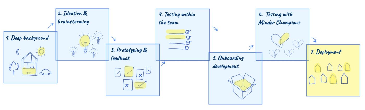
How is the project approached?
The first point of call was to establish a name for the centre’s user facing service. After exploring multiple options, and after testing them with the Minder Champions (or ‘Trusted users’ as they were known at that time) and other stakeholders, Minder was a clear winner. ‘Mind’ refers to the research and technology within the field of dementia, and ‘Minder’ implies that our participants are cared for and supported.
Based on our knowledge to date working with users, researchers and clinicians we created three different brand directions that were based on 3 different user needs (to be understood, to be motivated and to be connected). There is a lot of overlap between these needs, they are not mutually exclusive, however we chose this approach as it allowed us to identify the brand priorities and to be more experimental and creative with our thinking.
The first direction was based on the need to be understood, to explore how we can give the brand and system a personality, placing communication at the centre of the design. The second direction was focused on the need to be motivated, using a more data based approach to gamify the experience and take users on their own journey. The third and final direction was all about connection, looking at how we could build a sense of community through the brand, taking visual inspiration from neuroscience and how brain networks interact.

Alongside creating these directions, we also mapped the relationship Minder has with other organisations. This was an important step to ensuring we were aligned with the UK DRI and service delivery partners, as well as ensuring the brand could sustainably evolve with the research and technologies.

We then went onto to review the brand directions and organisational map with both the centre’s stakeholders and our Minder Champions group to gain feedback and ideas on how to improve the brand. These insights fed into a finalised vision which was tested with both groups one final time. To integrate the brand across the wider centre, the team created comprehensive and accessible guidelines and templates which allows researchers and clinicians to implement the brand across multiple touch points. For more high fidelity and complex products, the Helix team have created a series of prototypes with the new brand (eg. Minder Check-in, Minder Tests, Minder Carer’s App).
What role does Patient and Public Involvement and Engagement (PPIE) play in this project?
In its essence, a brand is not defined by what the organisation says it is, but how the users interpret it . For this reason, PPIE was central to the creation of the brand. We did three rounds of feedback sessions with the Minder Champions. First to get feedback on the name itself; secondly to test the three directions, getting insights on colours, fonts, imagery, language; and to wrap up the process we gained a detailed understanding of their views on the final brand direction.
What were the key insights to emerge?
Experimenting with different visual routes helped to highlight some key accessibility requirements for our participants, especially around the language used whilst also considering people with colorblindness in our choice of colours.
This brand process helped to raise important questions around what we want to achieve as a service, particularly in the ongoing tension between focussing the work towards a cohesive service, or creating an expanding platform for divergent innovations.
It was very rewarding and surprisingly fast to see how the new name ‘Minder’ and the associated brand became adopted across the centre. Strong advocacy from the centre’s leadership team helped, as well as the knowledge that it was co-designed and approved by our Minder Champions. But it also spoke of how valuable a common language is in complex organisations. The brand has helped engagement from the wider centre and given the team a sense of ownership and pride as well as the users at home.
Next steps
Although the ‘brand’ is now designed and firmly embedded within the centre, the design team will continue to help the rest of the centre in implementing it, to ensure consistency and to expand it when new applications demand it as the centre’s work scales up.
Internally, the brand also did a lot for the standing of the Helix design team within the Centre, as a first ‘concrete’ output that people across the centre could use and see the benefit of. Academic research centres are not generally known for being ‘driven by design’, but the brand has now effectively become a filter for ensuring a high standard of participant experience in the associated studies.